Munchflix
Movie theater snack ordering app
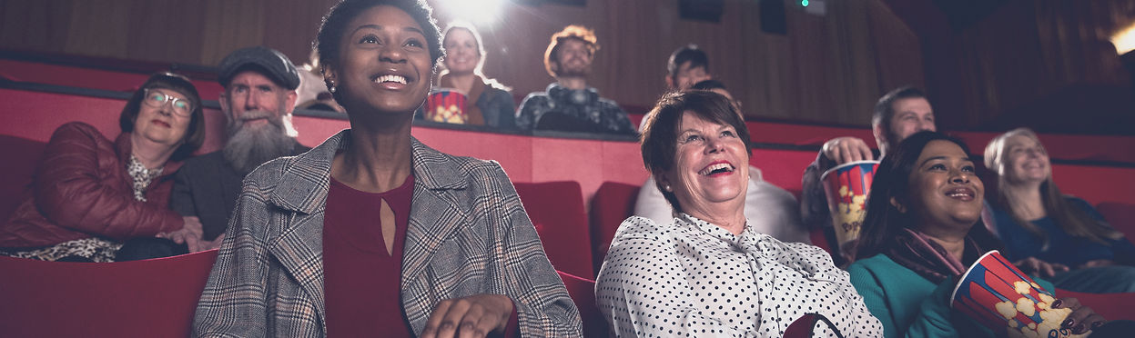
MunchFlix is a snack ordering app designed for Synamatic Theaters, a fictional movie theater. This personal project was created as part of my Google UX Design Certification to enhance the moviegoing experience by allowing users to order snacks ahead of time and pick them up without waiting in line. The app is designed for moviegoers of all ages in a small-town setting who want a more convenient and efficient concession stand experience.
Role UX Designer
Tools Figma, Zoom, Mural
Timeline Jun 2022 - Jan 2023
Challenge
Long concession lines can take away from the moviegoing experience, leading to frustration and missed moments. The challenge was to create a seamless way for users to browse, order, and pick up snacks without delays. Key focus areas included ensuring a smooth navigation experience, an intuitive checkout process, and a hassle-free ordering system.
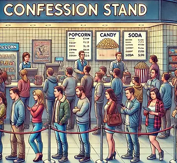
image generated by ChatGPT
Objective
-
Conduct research to identify pain points in the traditional concession stand experience and understand user needs.
-
Design a mobile app that enables moviegoers to order snacks ahead of time for quick and hassle-free pickup.
-
Ensure a smooth and intuitive user experience by addressing common challenges in browsing, ordering, and checkout.
Competitive Audit
A competitive audit was done to learn about what other snack ordering apps are currently available on the market. Each of the competitors were evaluated by the products they offered, their visual designs on both web and mobile applications, target audience, accessibility, user flow and ordering/payment processes.

1. Cinemark: Large US-based movie theater company that is a direct competitor. Their target audience is kids and their parents. They allow users to pick up their snacks at the movie theater and have a large selection of food and drinks. Also, they have a free rewards program, Movie Fan.
2. AMC Theaters: Large US-based movie theater company that is a direct competitor. Their target audience is teens and allow users to pick up their snacks at the movie theater. They have a free rewards program, AMC Stubs Insider.
3. Regal Cinemas: Large US-based movie theater company that is an indirect competitor because their target audience is movie goers in large suburban areas, whereas Synamatic Theaters is in small towns. They have a free rewards program, Regal Crown Club.
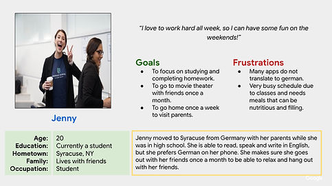
Personas
To better understand the snack-ordering experience at movie theaters, ten individuals of different ages and backgrounds were surveyed. Their feedback helped shape two personas, providing insight into user needs and guiding the design process.

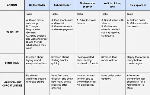
User Journey Maps
User journey maps were created for both Maria and Jenny to better understand their experiences and challenges when ordering snacks. Mapping their journeys helped identify key pain points and highlight essential features to improve the ordering process. This analysis led to several opportunities for enhancing the app, including:
-
Group ordering for a more convenient experience
-
A first-time discount to encourage new users
-
Post-order ratings (stars) for user feedback
-
Real-time order status updates for transparency
-
Estimated pickup times to reduce uncertainty and wait times

Big Picture Storyboard
Scenario: Use Munchflix app to order snacks at movie theater
This drawing depicts Maria and her daughter as they plan to see a movie and need to order snacks, highlighting their experience and interaction with the app.

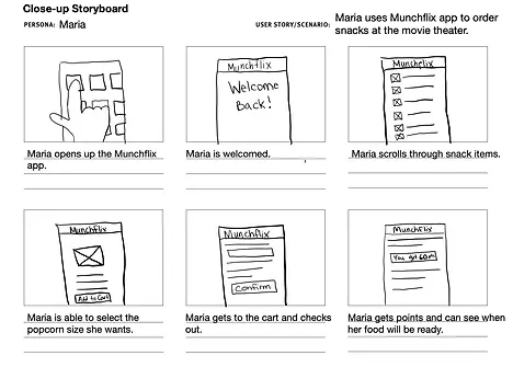
Close Up Storyboard
This drawing shows Maria using the Munchflix app and trying to order snacks to pick up at the movie theater.
Scenario: Use Munchflix app to order snacks at movie theater
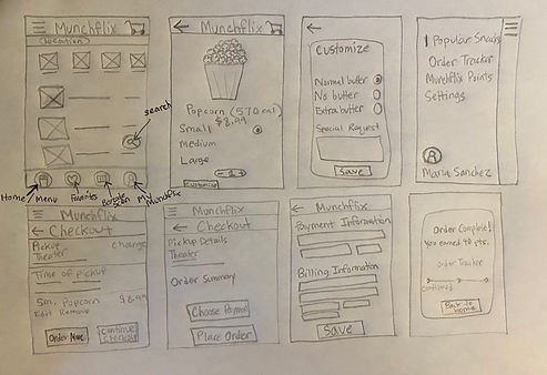
Paper Wireframes
Paper wireframes were created to quickly explore different layout ideas for the MunchFlix app. Sketching multiple variations helped prioritize essential features, such as an intuitive snack selection process and a seamless checkout experience. These low-fidelity designs made it easier to test different concepts before moving into digital wireframing.
Low Fidelity Prototype
Designed to establish the basic layout and functionality of the MunchFlix app, these wireframes focused on key screens such as snack selection, checkout, and order tracking. A round of usability testing was conducted with five participants, revealing key insights:
-
Two participants did not understand the function of the customization box, as they assumed everything to customize would be visible on the customization screen.
-
One participant expected to see search bar on top instead of on the bottom as you scroll.

Refinements
The 'customize' box was changed to a special requests box, allowing users to enter their requests directly.
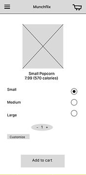


The search bar is now at the top of the screen which makes it easier to locate.
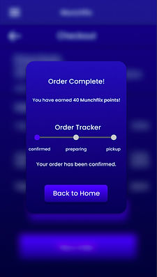
High Fidelity Prototype
Refining the high-fidelity prototype, this phase focused on enhancing the visual design, interactivity, and overall user experience. To create a more immersive feel suitable for a movie theater setting, the screens were designed with a darker theme. A round of usability testing was conducted with five participants, revealing key insights:
-
One participant clicked the "Place Order" button before entering card information.
-
Three participants had difficulty noticing Munchflix points.

Refinements
To improve visibility, the "40 Munchflix points" text was changed to neon blue. Additionally, the app's color scheme was adjusted from dark purple to a deeper blue-purple shade for better contrast and readability.

Accessibility
-
W3C says animations need to be under 5 seconds long to be accessible 150-500 milliseconds, so all my animations are 300 milliseconds.
-
Utilized a dark blue background to accentuate contrast, enhancing legibility with white text.